To simplify working with a large number of records in its data tables, Opus provides options to reorder records within a table (sorting), and to control which records display (filtering). Both of these options can be applied in a range of ways, either independently or at the same time. This article deals with the second of these, the Filtering Options.
Filtering Options are accessed through one of five interface elements, each described in this article:
Column Filter: Text Input (user input field in a table column header)
Column Filter: Dropdown Menu (clickable menu in a table column header)
Table-Wide Filter: Show Only Button (button outside the table)
Table-Wide Filter: Checkboxes (checkboxes outside the table)
Table-Wide Filter: Text Input (text field outside the table)
!
Empty data table? Users should keep in mind that some filters, when applied in combination, produce no results by definition. One example is found below in the Show Only Button Filter section, but the same principle applies elsewhere. If you see an empty table after using a filter and you can't figure out why, consider using the "Reset Table" button (for more information see the Tables Overview article linked near the bottom of this page).
Column Filters
There are two types of column filters, which differ from table-wide filters in that they filter records based only on data in their column:
Text Input Filter
Some Opus data tables feature text fields in their column headers. These text input filters work much like a search, particularly when they appear in a Name column. As the user types, the table updates in real time (with a slight delay for processing) to display only records that contain the input text, as shown in the screenshot below. Opus suggests a last name<comma> first name format for this input — support for other formats is limited.

A text input field column filter.
Dropdown Menu Filter
Some Opus data tables feature dropdown menu filters in their column headers. There are two types: regular and checkbox style. Regular ones allow users to filter for a single term, while those with checkboxes allow users to filter for more than one term.
A regular style dropdown menu column filter.

A checkbox style dropdown menu column filter.
!
Note that dropdown menu column filters list every possible item for the type of data in their column, regardless of whether all these items actually appear in the data table. Taking the Department column in the above screenshot as an example, every department in the University of California system appears in the dropdown menu, even if the user's login permissions do not allow them to see records from most of these departments (for information about permissions, see the article About the Opus Website, linked near the end of this page).
Regular Style Dropdown Menu Filters
These are very straightforward. Clicking one of them simply opens a dropdown menu from which the user can select a single item. Once an item is selected, the table only shows records with that item in this column.
Checkbox Style Dropdown Menu Filters
Checkbox Items
When an item is checked, the table will display records with that item in this column; when an item is unchecked, the table will hide records with that item in this column.
Keyword Filter
Checkbox style dropdown filters employ a nested keyword filter that allows the user to find items in the dropdown menu more quickly. You can see this in the above screenshot, with the text “Enter Keywords.” When the user inputs a keyword in this field, only items which contain the input text are displayed in the dropdown filter. This allows the user to find checkbox items faster than manually scrolling would. Using this filter in combination with the "Uncheck All" and "Check All" buttons allows the Filtering Options to be quickly customized, as explained next.
Check All and Uncheck All Buttons
These buttons affect dropdown menu items that are currently visible. Clicking "Check All" checks the boxes next to all visible checkbox items and shows (in the table) records which include the checked terms (except those filtered out by other means). Clicking "Uncheck All" unchecks the boxes next to all currently visible checkbox items and hides (in the table) records which include the checked terms.
The term “currently visible” in this case refers to the presence of checkbox items in this dropdown menu, as determined by the keyword filter. Using the keyword filter with the "Check All" and "Uncheck All" buttons allows the user to quickly check or uncheck a particular class of terms in the dropdown menu.
Table-Wide Filters
There are several types of table-wide filters, which differ from column filters in that they filter all records in a table:
Show Only Button Filter
This allows the user to limit visible records to certain pre-made categories. An example is found on the Roster page (see link near the end of this article), which features a "Show Only" button near the upper-left corner of its data table. Clicking this button displays a dropdown menu:
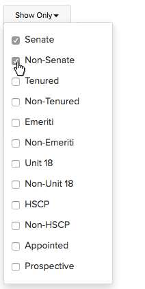
The Show Only button from the Roster page, with its dropdown menu. Click this image to view a larger version.
The checkboxes in the menu under the Show Only button can be used individually or in combination. Note that checking more than one will cause the table to display only records which match both criteria (in Venn Diagram terms, this is an and filter).
!
Note: Choosing two or more mutually exclusive items in the "Show Only" button menu can sometimes result in a seemingly empty table. For example, in the above screenshot both "Senate" and "Non-Senate" are checked. Since it would be impossible for any record to match both these criteria, the data table would be empty. If you get confused by a blank data table, try using the Reset button to start over.
Checkbox Filter
Functionally similar to the Show Only button, checkbox filters provide quick access to records of a particular, pre-established category, such as appointees with mandatory actions or appointees based in your department — two types of checkbox filter that appear on the Eligibility page. This type of filter appears above the buttons of its data table, at the top left corner (see the screenshot below). Because these filters are page-specific, descriptions of their specific functions are found on the support articles for the pages on which they appear (e.g., the article describing the Eligibility page, linked near the end of this article).

Checkbox filters above a data table. Click this image to view a larger version.
Text Input Filter
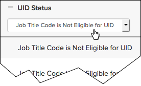
In the screenshot below is a text field labelled "Search" near the upper-left corner of the data table. Typing into this field searches all columns for text that matches the input, and hides records which do not contain that text.

A text input filter on the Request a UID page, here filtering for content in the UID Status column. Click this image to view a larger version.

A text input filter on the Request a UID page, here filtering for content in the Name column. Click this image to view a larger version.
See Also
Data Tables: Sorting Data Within A Table