Opus is moving to a new format for our reports (data tables). We will slowly move tables from the old to new format. The new format is outlined below and in the related articles.
As of April 2026, the only table using the new format is the Academic Apprentice Personnel report, which is currently only available to AAPO.
To simplify working with a large number of records in its data tables, Opus provides options to reorder records within a table (sorting), and to control which records display (filtering). Both of these options can be applied in a range of ways, either independently or at the same time. This article focuses on filtering.
Column Filters
Filtering Options are customized for each column.
Columns will have some variation of the following filter options. To view filter options, click the filter icon at the right of the column.
- For text: Search, fuzzy matching, contains, starts with, ends with, Equals, Empty, Not Empty
- For dropdown menus: Select all, Clear all, Checkboxes
- For numbers: equals, between, between inclusive, greater than, greater than or equal to, less than, less than or equal to, empty, not empty
- For dates: equals, between, between inclusive, empty, not empty
Search Filter
Some columns can be searched directly (e.g. the Name column). The table updates to display only records that contain the input text, as shown in the screenshot below. Additional filter options can be applied to the search by accessing the dropdown menu from the filter icon.
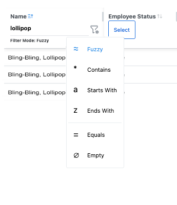
A text input field column filter.
Dropdown Filter
Some Opus data tables feature dropdown menu filters in their column headers. Checkboxes allow users to filter for more than one term. In the following screenshot, there are three possible ways of filtering within these dropdown menus shown.
- Filter State: Default
- Note the default state for all dropdown filters is to have all checkboxes unchecked despite all options being visible in the data table.
- Filter State: Checkboxes
- When an item is checked, the table will display only records with that value in this column; when an item is unchecked, the table will hide records with that value in this column. This state shows "Select all" has been applied. Clicking "Clear all" will reset the boxes to their default state of unchecked.
- Searching within the Dropdown Menu
- Checkbox style dropdown filters also employ a nested search filter that allows the user to find items in the dropdown menu more quickly. When the user inputs a keyword ("earth") into the field with the text "Search options...", only items which contain the keyword are displayed in the dropdown filter. This allows the user to find checkbox items faster than manually scrolling would.
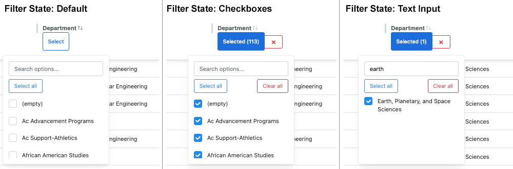
Dropdown menu column filter states.
Date Picker Filters
Columns with dates have the option to enter a date via a text field or date picker filter.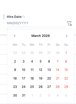
Multi-Column Filtering
Users may want to use Filtering Options in multiple columns simultaneously. This can be done by holding the Shift key down while filtering additional columns.
NOTE: In a future release, users will be able to see which columns the table is filtered by displayed above the table.
See Also
Data Tables: Sorting Data Within A Table